- Carl's Product Roundup
- Posts
- The Fundamentals of Interaction Design (with 43 original examples!)
The Fundamentals of Interaction Design (with 43 original examples!)
Your ultimate guide to frictionless product experiences
Carl Vellotti
July 20, 2023
Every interaction point in your product is an opportunity to help your users:
Get to the next step in the funnel
Understand how your product works
Intervene when something goes wrong
Add delight when something goes right
The list goes on.
Crafting these interaction points is called interaction design, a discipline that sits firmly at the intersection of UI and UX. Good interaction design is what separates good products from great products.
The concepts of good interaction design are helpful for many other kinds of communication as well, including professional internal communication and even personal situations.
Basically, any time you want to motivate others to do something, you want good interaction design. These are timeless principles that every Futureproof PM should master.

This is an absolutely gargantuan post, so let’s just get into it.
We’ll cover:
Fundamentals of Reducing Friction
43 examples of interaction design
Further reading
Fundamentals of Reducing Friction
Before we get into the examples, it’s helpful to understand the underlying theory.
The main goal of all interaction design is to reduce friction.
You do this by making sure users always know the answers to these questions:
Where am I?
How did get I here?
What should I do next?
Why should I do it?
Where is all this going?
If these questions ever stump your users, they’re more likely to get confused and ultimately churn from your product.
The best way to learn this is to see this in action!
EXAMPLES
⚠️WARNING
The proceeding knowledge cannot be unlearned! The examples cannot be unseen.
If you continue down this path you will soon find yourself frustrated by bad interaction design in many, many products.
You’ve been warned.
Design patterns
We’ll start off with the most common and powerful interaction design patterns.
1) Remove friction with suggested options
Your users are always asking "what now?”
Make it as easy as possible to answer that question.

I am often associated with lions, tigers, and bears.
2) Make interactions obvious
When a user can take an action, make it clear.
Try to use standard conventions when possible.

3) Motivate your users to take action with clear CTAs
Remember, CTA = call to action.

4) Illustrate your product benefits whenever possible
Your user is always asking “what’s in it for me?”
Be as concrete as possible.

When users use your product, they’re taking a risk with their time and money.
If many others are using your product, it seems less risky.

6) Use the concept of scarcity to motivate action
Let your users know when something is in limited supply.
(Only use this tactic when it’s true!)

You can also derisk your product by showing that successful people use it.

Not 100% sure this is the best endorsement.
8) Time your asks carefully
Be strategic with every ask you make.
The more contextual, the better.

9) Set expectations whenever possible
After “what now?” users ask “what happens if I do this?”

10) Anticipate your user’s fears
Setting expectations is especially important when for irreversible actions.
Help users understand exactly what they’re doing.

11) Show progress to illustrate what’s happening
Once your user finally takes an action, don’t leave them hanging.

12) Give feedback at every step of the way
Never assume your users understand what just happened.
Every action should have some kind of feedback.

13) Celebrate the wins
For especially momentous actions, use feedback to celebrate!

Nice work making it 13 images in! Keep going!
14) Never lead your user to a dead end
Too many dead ends and your product is dead.

15) That includes positive dead ends
Even when something good happens, users still need to know what to do next.

16) Keep negative dead ends motivational
When a user reaches a negative dead end, make the path forward positive.

17) Keep actions consistent
Your user is actively trying to figure out how to use your product.
Don’t switch things up on them in the middle.

Quick announcement – I’m testing out a referral program!
Help me grow this newsletter to earn some cool prizes.
Level 1 is easy! Get one friend to sign up and I’ll shout you out to my 10K+ Twitter followers to show my thanks 🙂 You’ll also show up on my leaderboard and automatically be eligible for future prize tiers as they’re added.
Get the link here 👇
Error Messages
Not everything will go right all the time. Here’s how you can help:
18) Make it easy to get unblocked
And when users do reach dead ends, make it obvious what they need to do next.

19) Give clear instructions on how to proceed
Your users don’t know how to make your product work, and they usually won’t try too hard to figure it out.

20) Link directly to actions when possible
This is a combo of several concepts covered so far.
21) Be wary of your user’s emotional state
Tailor your copy precisely to what your user is actually doing.

Stylistic Stuff
Now we’ll cover the nitty gritty stylistic and grammar aspects of interaction design. These might seem small, but they can go a long way in helping your users build a mental model of your product.

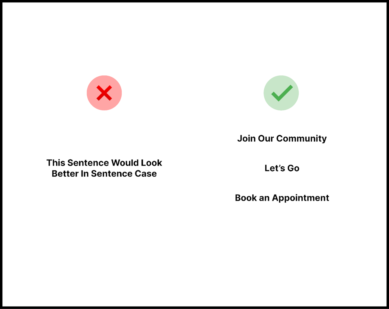
23) Only capitalize every word for short CTAs
24) Use images to make actions clear
In general, less reading = less friction = better

25) Keep your company’s brand and tone in mind
Breaking your company’s overall tone will throw your users off.

26) When to spell out numbers
Spell out small numbers ranging from one to ten.
Use numerals for larger numbers (i.e., above ten).

27) When to use “my”
Use “my” when you want to convey user ownership.

28) When to use “your”
Use “your” to convey things your product has created for the user.

29) Address your user’s items directly with “your”

30) Use the active voice to convey actions
An active voice helps users understand cause and effect.

31) Use “we” when you want to make it clear your product has taken the action

32) Use passive voice when the action itself is most important
Passive voice is useful when the action itself is more important than what/who caused the action.

33) Use humor sparingly and thoughtfully
Humor has its place, but (usually) not all over the place.

34) Avoid technical jargon
Avoid using technical terms as much as possible (unless you have a technical audience).

35) Use contractions sparingly
Contractions give your product a more conversational tone, but too many feel childish.

36) Be concise and keep it skimmable
Imagine your users are always busy and want to move on to the next thing.

37) Assume your user is smart
Your user is busy, but not dumb.
Aim to give the least amount of direction for them to be successful.

38) Use normal words
Your users won’t be impressed by your vocabulary.

39) Pay attention to your capitalization
Capitalize nouns correctly.
Doing this wrong loses credibility, fast.
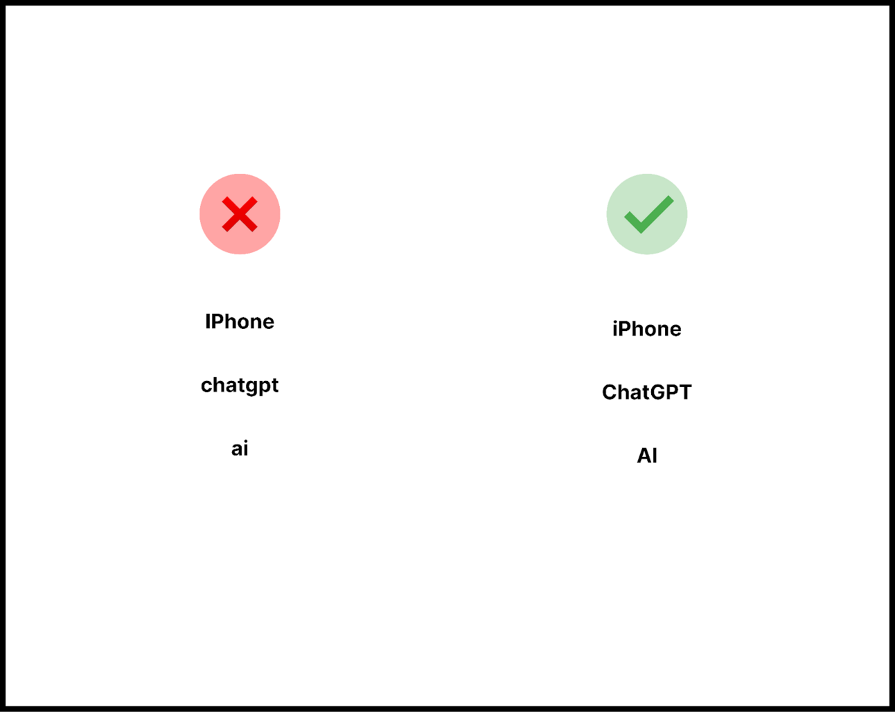
gen z products can probably violate this rule
40) Be wary of colloquialisms
Be careful with colloquialisms.
These can easily catch non-native speakers off guard.

Accessibility
Finally, there are a few things to check to make sure all this interaction design doesn’t go to waste.
41) Make sure you have enough contrast

42) Always test different device font defaults
Make sure you test your product with different default font sizes.
Especially important on mobile.

43) Always test other languages
Similarly, test out different language defaults, especially on mobile.
Further Reading
Normally I’d cover an AI use case for the topics above, but I bet you’re exhausted by now.
So stay tuned!
In the meantime, munch on these:
Check out @hobdaydesign on Twitter. Amazing interaction designer.
What is user friction? How to avoid the mistakes and optimize your UX